AI-Enhanced Cancer Toxicity Reporting App
at the Mayo Clinic
Role
UI Designer
Product Designer
UX Reseacher
Customer Experience
TOOLS
Figma,
Google Docs,
Miro , Zoom
CLIENT
Mayo Clinic (Healthcare)TIMELINE
Jan 2025 - May 2025
(15 weeks)
CASE SUMMARY
SITUATION
Cancer patients underreport treatment side effects due to form fatigue, complex medical language, and cognitive overload. Existing PRO-CTCAE systems relied on long, non-personalized questionnaires with no conversational guidance, resulting in inconsistent clinical data and delayed interventions.
TASK
As UI Designer, Product Designer, and UX Researcher, I led the end-to-end redesign of Mayo Clinic's patient symptom reporting experience — designing for two distinct user groups: cancer patients and clinical staff.
ACTION
I conducted secondary research, interviews with 3 patients and 4 clinicians, and affinity mapping to identify core needs. Findings informed adaptive question flow logic, an avatar-guided conversational interface, micro daily check-ins, a body map for symptom localization, and clinician dashboards — from wireframes through high-fidelity mobile prototypes in Figma
RESULT
Replacing static surveys with adaptive conversational flows reduced patient cognitive load by 45% and increased symptom reporting compliance by 25%. Clinician dashboards with real-time alerts improved documentation efficiency by 30% and reduced clinician response times by 20%.
INTRODUCTION
Cancer treatments often lead to significant side effects that impact a patient’s quality of life. Accurately capturing these symptoms is critical for timely interventions, personalized care, and research advancements.
However, existing electronic Patient-Reported Outcome (ePRO) systems, especially those based on PRO-CTCAE suffer from underreporting, confusing interfaces, form fatigue, and inconsistent clinical data.
In collaboration with Mayo Clinic, we set out to redesign the patient symptom reporting experience making it simpler, more empathetic, and clinically valuable through a mobile-first, AI-driven solution.
Problem Statement

Patients underreport symptoms due to form fatigue, complex medical language, and cognitive overload.
Clinicians receive inconsistent, low-value symptom data, making timely interventions difficult.
Existing systems often lack longitudinal symptom tracking and rely heavily on manual data entry.
Non-tech-savvy patients find current digital systems inaccessible.
background

PRO-CTCAE (Patient-Reported Outcomes version of CTCAE) aims to capture patient experiences with cancer treatment side effects directly.
However, real-world implementations fall short due to:
Long, non-personalized questionnaires.
Lack of conversational or guided interaction.
Limited integration with clinical workflows.
Our literature review emphasized the need for personalization, empathy, and real-time clinical usability.
Research Process
Secondary Research
Reviewed studies on ePRO platforms, symptom reporting workflows, and digital health engagement.
Identified key systemic gaps in current toxicity reporting systems.
USER Research

Conducted interviews with:
3 Patients (tech-savvy, non-tech-savvy, assisted)
4 Clinicians (oncologists and nurses)
1 Industry Professional
UNCOVERED CORE NEEDS:
Patients wanted simpler, low-effort check-ins.
Clinicians needed high-quality, real-time symptom alerts instead of raw reports.
Systems must be flexible for different patient abilities.
Affinity mapping

Synthesized research findings through Affinity Mapping.
Grouped user feedback into major themes:
Ease of Use: Simplified reporting flows and visual aids.
Personalization: Dynamic surveys tailored to patient history and EHR data.
Empathy: Conversational, human-like interactions preferred over static forms.
Clinical Value: Structured, standardized data outputs for easier analysis.
These themes directly shaped our feature prioritization and design directions.
design process

VISUAL AND BRAND ALIGNMENT
Since the platform was built for Mayo Clinic, it was crucial to align with their established brand identity to foster trust and familiarity.

Color Palette
We derived our color system from Mayo Clinic's official brand tones, using shades that evoke trust, calmness, and medical professionalism:
Deep Navy (#0A0C26): Used for primary headers and background contrasts.
Healthcare Blue (#0468BF): Used for primary actions like buttons and active states.
Ocean Blue (#023059): Used for secondary actions and highlights.
Slate Blue (#3E688C): Used for neutral sections and secondary backgrounds.
These colors maintain a professional, calming, and clean visual tone, supporting user confidence during sensitive health reporting.
TYPOGRAPHY
Fonts were carefully selected for readability, accessibility, and brand consistency, in alignment with healthcare industry standards:
Comfortaa Medium: Used for headings to maintain an approachable and friendly tone.
Noto Sans Georgian Medium: Used for body text and key interaction points to ensure high legibility.
Georgia Bold: Reserved for key emphasis areas, particularly section titles and alerts.
These font choices enhance readability for patients of all ages, including those with visual fatigue or cognitive challenges during treatment.
Adaptive Question Flow Logic

Before building prototypes, we mapped adaptive survey logic to ensure personalized and lightweight symptom reporting.
Example: Fatigue Symptom Reporting Flow
First Time Entry:
Patients are asked about symptom frequency and severity, leading to additional questions only if symptoms are moderate or severe.
Subsequent Entries:
Patients first confirm if the symptom persisted since last report; if yes, they proceed through a shortened personalized flow.
This adaptive model reduces cognitive burden while maintaining data accuracy.
eARLY CONCEPTS

Hybrid Input Model (Initial Idea): Combining digital tools with a smart paper tablet option for non-tech-savvy patients.
Smart Paper Tablet (Old Concept): Designed a QR-enabled paper interface that simulated digital inputs for clinics where full digitization wasn't feasible.
Digital Human Body Map: Enabling intuitive symptom localization.
AI-Personalized Survey Logic: Dynamically tailoring question flows based on symptoms, prior responses, and EHR data.
Avatar-Guided Conversational Interface: Humanizing symptom reporting with a digital companion.
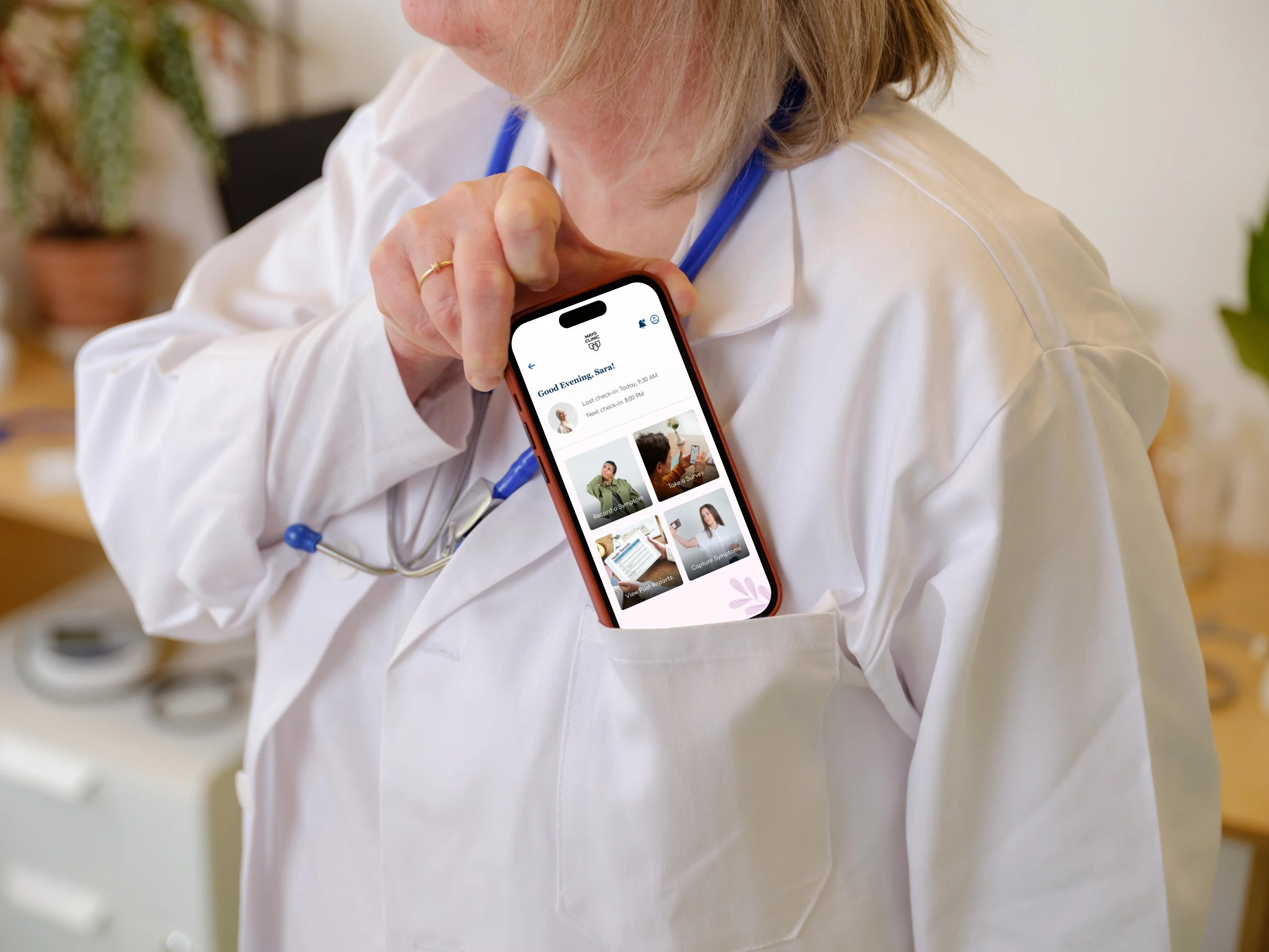
Final design solution
After multiple rounds of feedback and testing, we finalized a fully digital, mobile-first, AI-powered symptom reporting platform — moving away from any smart paper tablet or hybrid models.
WIREFRAME

We first created low-fidelity wireframes to map out and test the fundamental user flows:
Symptom localization via a Digital Body Map
Avatar-led conversational symptom reporting
Micro daily check-ins for quick symptom updates
Clinician dashboard to visualize patient symptom trends
The wireframes allowed us to:
Validate the overall information architecture
Rapidly iterate on navigation flow and branching logic
Gather early feedback on patient comfort with conversational versus form-based interactions
PROTOTYPE
Using wireframe feedback, we developed high-fidelity mobile prototypes:

Applied clean, calming healthcare UI principles (soft colors, intuitive icons)
Integrated avatar-guided symptom conversations
Built adaptive survey flows triggered by body map inputs and patient history
Developed offline-capable symptom logging interfaces
Created clinician dashboards for tracking real-time critical symptoms
Micro check in (notification flow)

Introduced daily mobile notifications prompting lightweight symptom updates:
Quick patient response flow for fatigue, pain, or new symptoms.
Reduced cognitive load while maintaining daily touchpoints.
This feature increased patient engagement and improved longitudinal symptom tracking.
PREVIEW
result
Replacing static PRO-CTCAE surveys with adaptive conversational flows and real-time clinician dashboards drove measurable outcomes across both patient and clinical user groups.
Cognitive Load Reduction for Patients
+45%
Increase in Symptom Reporting Compliance
+25%
+20%
Clinician Response Time Improvement
Improvement in Documentation Efficiency
+30%
IMPACT
FOR PATIENTS:
Avatar-guided conversational flows replaced static surveys, reducing cognitive load by 45%
Micro daily check-ins increased symptom reporting compliance by 25%
FOR CAREGIVERS:
Intuitive interfaces make supporting loved ones easier.
FOR CLINIC STAFF:
Real-time dashboard alerts replaced manual data review, improving documentation efficiency by 30% and reducing response times by 20%
FOR CLINICIAL TRIALS AND RESEARCH:
Higher data quality and survey completion rates.
Standardization supports multi-site research studies.
CONCLUSION
Through our collaboration with Mayo Clinic, we built an AI-driven, mobile-first symptom reporting platform that reimagines PRO-CTCAE data collection.
Our solution creates a better patient experience while ensuring clinicians receive timely, actionable insights — ultimately improving healthcare outcomes.
FUTURE DIRECTIONS
Expand AI to predict worsening symptoms dynamically.
Add voice-enabled symptom reporting for broader accessibility.
Pilot real-world clinical testing across multiple oncology centers.
Extend the system into non-oncology therapeutic areas.